They’re all around us, but they’re easy to overlook. We walk past them all the time, perhaps glancing at them, but rarely really noticing them. But when we need them, we really need them.
What on earth are we describing? The humble wayfinding sign.
Wayfinding signs are the sort of thing schools and offices install because they have to. People use them for the same reason — they have to in order to know where to go. With such a practical purpose, it’s no wonder most places only think about the function of their wayfinding signs. Are they clear and accurate, or not? That’s why so many signs wind up being simply bland directional indicators.
But done intentionally, wayfinding signage can bring character and individuality to your environment. Whether it’s with unusual shapes and graphic elements, or with distinctive colors, there’s a surprising number of ways to make wayfinding signs unique. Let’s take a look at a couple examples that succeeded.
A Wayfinding Sign that Brings a Smile
Our first example is a sample sign ZENTX made to prove this very point: that wayfinding signage doesn’t have to be boring. It doesn’t get much more fun and nostalgic than crayons, after all. Just about everyone — kids and adults alike — has some pleasant memory of relaxing with a coloring sheet and a box full of imagination-sparking crayons.
This prototype is the sort of wayfinding sign that would be perfect for a school or daycare or other childcare setting. Elementary schools might decorate their walls more colorfully than upper-level schools, but their signage is just as vulnerable to blandness. A crayon wayfinder, though — now that adds some character and friendliness to the space.

A Wayfinding Sign that Stands Out
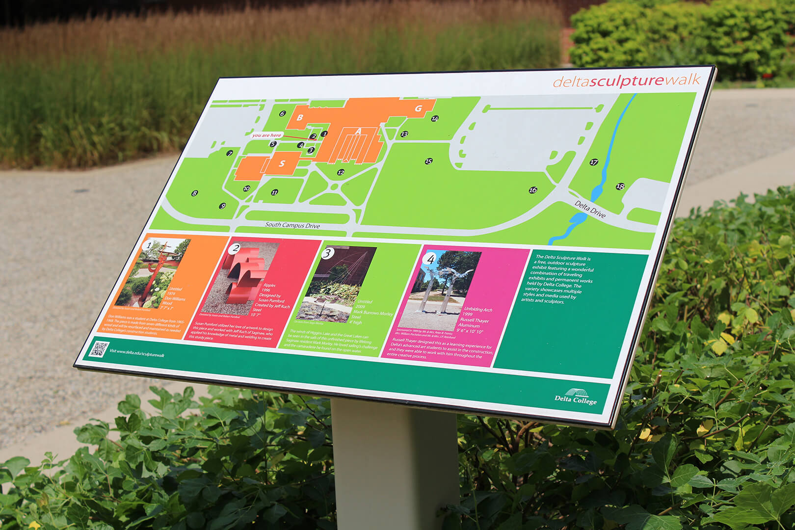
This next sign also uses color, but not quite like the crayon sign. Delta College is home to several outdoor art installations featuring contemporary sculpture. The school wanted to provide a map of each piece, so they asked ZENTX to create some large signs to put by the campus’ sidewalks.
Because the signs would have to compete with many other signs and landscaping elements to stand out, we made sure to make them colorful. The clear, easy-to-read map takes up most of the space, of course.
But in the lower third of each sign, Delta wanted to include information about the art on display. Those highlight boxes catch the eye with a medley of bright colors that make the sign anything but bland.
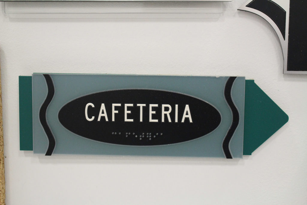
A Wayfinding Sign that Reinforces Branding

The last wayfinding signage we want to look at is…our own. At the risk of tooting our own horn, we do think our signs are pretty good examples of how a business can use wayfinding signage to complement their branding.
On some of the signs, we included our logo in a visible-but-unobtrusive spot. On others, we went even subtler. The two swooshes at the bottom of each door plate? They’re taken from our logo, reinforcing our branding even though the logo as a whole isn’t there.
Besides that, we used a variety of finishes and materials in our signs, for some extra visual appeal. Reflective chrome-like veneer, translucent acrylic, semi-reflective swooshes — it’s all there. Wayfinding signs aren’t supposed to be people’s main focus, but that doesn’t mean they can’t look interesting.
So what do you think? Convinced yet that wayfinding signage can express some creativity? We have more examples we could have used: Fullerton Tool’s office comes to mind, for instance. Giving these often-overlooked signs some attention can make the difference between a semi-branded space and an environment with subtle nods to your business at every turn.